
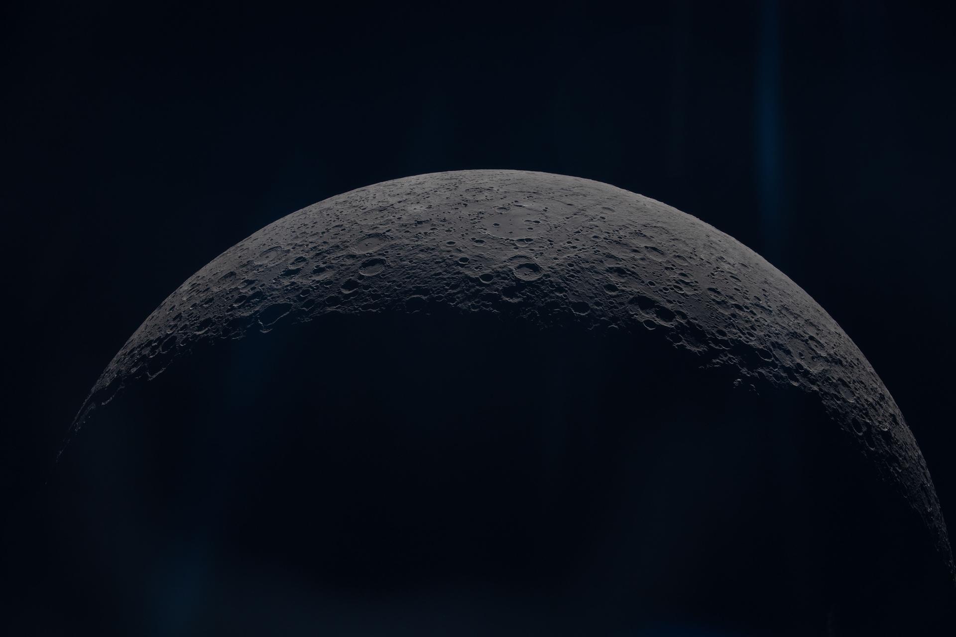
A dark, photographic, single-accent design language that powers sunnyside.tv. Inter as the system typeface, square corners everywhere, one warm orange that carries 100% of the brand recognition.
01 / BRAND
LOGO, WORDMARK, VOICE
Square mark over a dark cinematic ground. The mark is the only place a warm light leaks through the chrome - hover the sun icon to see the signature glow effect that mimics light catching a lens.
Sun mark - 100×100
Hover for the signature drop-shadow glow + radial highlight.
Wordmark
SUNNYSIDE
Uses the same clamp-based letter spacing as the header wordmark.
Sizes in production
32px mobile nav, 48px desktop nav, 84px marketing surfaces.
SYSTEMS OVER DECORATION
Every visual choice clarifies hierarchy, state, or interaction. Ornament earns its place by making complex creative work easier to read.
MOTION EXPLAINS STATE
Animation connects cause and effect: lines fill, controls respond, and media hands off without breaking spatial continuity.
CONTENT STAYS IN CONTROL
Payload owns page copy, galleries, typography scales, and visibility. The interface adapts without hard-coding editorial decisions.
TECHNICAL CRAFT IS THE VOICE
Specific tools, workflows, roles, and outcomes replace vague promotion. ComfyUI, FLUX.1, zBrush, and client names retain their real casing.
02 / COLOR
ONE ACCENT, MANY NEAR-BLACKS
A single warm accent (#ff6b1a) carries every brand moment: active nav, focus rings, hover underbars, link color, eyebrow labels. Backgrounds are three layered near-blacks sitting on top of a dimmed full-bleed photograph.
--accent
#FF6B1A
Brand sun-orange. The ONE color that signals brand.
--bg-primary
#030305
Page base behind everything.
--bg-secondary
#0A0A14
Lifted surfaces.
--bg-card
#0A0A12
Hover-card body.
--surface-media
#06060E
Media and poster ground.
--text-primary
#FFFFFF
Headlines, active state.
--text-supporting
#C0C0C0
Body copy and paragraph leads.
--text-secondary
#999999
Subtitles, mono meta, and labels.
--text-muted
#767676
Quiet tertiary copy.
--border-subtle
#151520
Hairline dividers.
--border-card
#1A1A28
Card edges.
--border-control
#252535
Default control rest state.
--border-control-strong
RGB(255 255 255 / 50%)
Prominent Home and workflow controls.
Accent opacity ramp
accent-12
Button focus ring
accent-16
Button press ring
accent-24
Tag fill
accent-36
Logo glow
accent-27
Sustained hover
accent
Full strength
Background photography
One fixed full-bleed photo per page (CMS-configurable), dimmed to 78% opacity with a near-black scrim so chrome stays legible.
03 / TYPE
INTER, FULL FAMILY
Inter is the single system typeface across navigation, display, body, and metadata. The CMS exposes independent display, mono, and body scale controls; the values below are the current base sizes before those multipliers are applied.
BODY COPY
Inter Regular
weight 400
Real-time technology and agentic AI amplify how ideas are built.
DISPLAY HEADLINES / PAGE H1 / NAV
Inter Medium
weight 500
THE SUNNYSIDE DESIGN SYSTEM
RESUME ROLE TITLES
Inter SemiBold
weight 600
SENIOR PRODUCT DESIGNER
CARD TITLES / EDU CHIP / BUTTONS
Inter Bold
weight 700
SKYRIM SET EXTENSIONS
EYEBROW LABELS (EXPERIENCE, EDU)
Inter ExtraBold
weight 800
EXPERIENCE
Type scale
display-1
64px / 500
SUNNY CHAN
display-2
48px / 500
PORTFOLIO
display-3
36px / 500
SPACE & MOTION
body-lg
18px / 400
Designing intelligent creative systems.
body-md
16px / 400
A dark, photographic, single-accent design language powers sunnyside.tv.
mono-md
16px / 400
3D VFX ARTIST · PRODUCT DESIGNER
mono-sm
14px / 500
2024 to PRESENT
mono-xs
12px / 700
RESUME
04 / SPACE & MOTION
MEASURED SPACE, PURPOSEFUL MOTION
Spacing uses a compact production scale, corners remain square except for semantic circles and sliders, and motion favors the shared decelerating ease. Duration changes with purpose: immediate controls stay quick while spatial reveals and hover chrome receive more time.
Spacing scale
4px
7px
10px
14px
18px
22px
28px
32px
36px
48px
60px
Common pixel values harvested from production layout.
Corner radii
RADIUS-NONE · 0pxRADIUS-PILL · 999px
Sunnyside is square. Exceptions are small pills (volume slider, resume dot, social glyph background).
Signature ease
LOOPS · 1.4s
--effect-ease: cubic-bezier(0.22, 1, 0.36, 1).
Production timing scale
160msLogo highlight opacity
180msCompact utility controls
250msNavigation underline
260msResume dot and popover close
320msButton color/border and popover open
380msButton underline sweep
400msHover-card chrome and media handoff
520msResume line and popover backdrop close
1000msNav ghost text and skill chips
Current durations harvested from navigation, cards, controls, popovers, and the resume timeline.
Popover shadow
The site's only drop shadow. Cards and buttons never use shadows.
Nav underline expansion
HOMERESUMEPORTFOLIO
Hover any item: 2px orange bar scales from 0 to 1 from center, 250ms ease.
Hover card animation
VFX
HOVER ME
TITLE SLIDES UP
Hover: media dims while title, gradient, and underline animate on the shared 400ms chrome lifecycle.
05 / COMPONENTS
ATOMS YOU'LL SEE ON THE SITE
Each specimen mirrors a current production component or uses the component itself. Hover and keyboard-focus the controls to see the same orange sweeps, border lifts, timeline fills, and restrained opacity changes used across the shipping pages.
Hover any chip: color #777 to #fff, border lifts to #555, background fades in. 1s ease - deliberately slow.
Home social glyph
42px square · white at 50% idle stroke · orange hover fill and stroke
Hover card volume
Bottom-left audio atom. Hover or focus to reveal the vertical volume slider; drag or use arrow keys to set volume.
Resume timeline entry
2024 to PRESENT
SENIOR PRODUCT DESIGNER
Apple Maps: Indoor Maps, AR Arriving Vehicle Interface.
2018 to 2024
LEAD 3D MODELER
Texturing, set extensions, real-time pipelines.
Hover the row: dot turns orange with a 4px glow, the vertical line fills top-down over 520ms after a 120ms delay.
Blockquote / summary
Designing intelligent creative systems that bridge visual storytelling, real-time technology, and agentic AI to amplify how ideas are built, experienced, and scaled.
16px base · 2px orange rule · CMS-controlled weight on Resume, Generative AI, and galleries
Hover card
VFX
SKYRIM SET EXTENSIONS
BETHESDA · 2011
400ms reversible chrome lifecycle; CMS controls title/subtitle visibility and typography per page and item.
Accessibility, responsive layout, layering, media behavior, and CMS controls are part of the design language—not implementation afterthoughts. These specimens document the current production contract.
Z-INDEX LAYERS
z: 8000Project popover portal
z: 1200Hover audio portal
z: 100Sticky nav
z: 2Hover-card chrome (bar, title)
z: 1Hover-card image
z: 0Page background photo
Major production layers, from the fixed page background through the modal portal.